
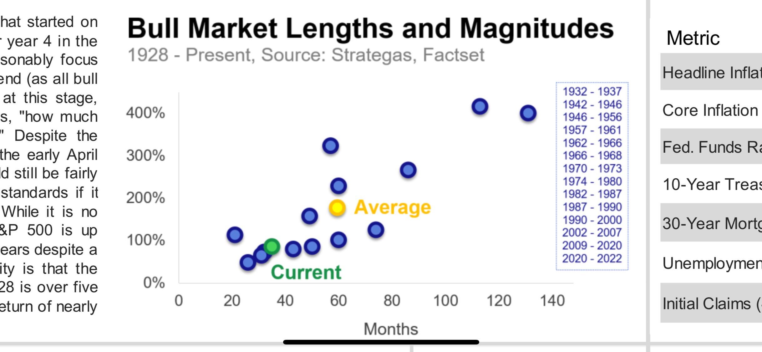
This is a chart made by my wealth management firm that they sent out that indicates where we are in respect to history. The discussion in the left write up was detailing all the talk about how the bull market can’t continue its run and its at the height and whatnot and saying it’s simply not true. We see this everyday on here that it’s just waiting to pop blah blah. We are the green dot. The only threat we face for the market is the current political climate.
https://i.redd.it/jckcqnme0jtf1.jpeg
Posted by Future-Raspberry-780
5 Comments
Amazing. Can you show the full picture or the full content on the description?
Counterpoint: this looks like a mean average rather than a median average. The mean is brought further out significantly by outliers.
Charts like this are worthless due to the outliers disrupting the averages. Should of used a bell curve instead.
On top of that the duration of a bull market following a -70% multi year bear market is going to last a lot longer than a bull market that follows a short lived bear market as seen in December 2018 and 2020. Both of which had a two year bull market cycle. In todays age bear markets are much more short lived but the consequence of that is a much shorter lived bull market with quicker melt ups. The velocity of movement both to the upside and downside is significantly different than 20+ years ago. Everything moves quicker
You are ignoring inflation. In real terms the market spends ~2x as long bearish as it does bullish. It took 26 years to recover from the 1929 crash, 18 years to recover form the 1964 crash and 15 years to recover from the Dotcom crash.
Stocks ripped in 2020 and 2021. It was a bubble. Stocks corrected in 2022. ChatGPT arrived in early 2023 and everyone lost their marbles.
This is a new bubble coming off an already high basis for valuations. It won’t end well. It could last for three more years. Make all the money you can until the music stops. But it won’t end well.